Using nostalgia to rekindle
Goetze’s is a fifth generation family-owned company and the largest producer of caramels in the U.S. They produce two iconic candies: Caramel Creams and Cow Tales. When we began working with them, they were looking to drive sales velocity and HH penetration. Despite caramels surging in popularity, sales had been relatively flat for years. Goetze’s was also concerned about losing share to new brands entering the subcategory. Our insights, planning and creative helped restore the love for this heritage brand.


INSIGHTS
To help Goetze’s realize their objective, Concentric first needed to understand exactly who their consumers were for both product lines, and then understand why those consumers were not purchasing more often—or stopped purchasing altogether. Primary research uncovered a number of insights. First, Caramel Creams and Cow Tales appealed to different consumers, with Caramel Creams consumers skewing older. Second, Caramel Creams had an identity problem. People recognized the candy more by its iconic shape and color than by any connection to the brand. Third, and perhaps most importantly, we discovered that although people loved these candies, the caramels had simply fallen off their radar and thus they routinely overlooked them in a crowded retail environment. However, when reintroduced to the candy, consumers were excited about rediscovering an old favorite.
GROWTH DRIVER
DRIVE VELOCITY
Goetze needed to re-ignite lapsed users, some of whom historically had a deep connection with the product. They could then leverage this nostalgia to reach the next generation of consumers, as well, through sharing.
STRATEGY
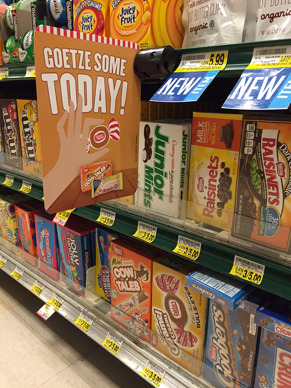
Capitalizing on the macro-trends of the resurgence of caramel flavors and the love of iconic candies that represented family connections and simpler times, we devised a multi-pronged campaign to allow consumers to rediscover Goetze’s Candy using a combination of advertising, retail in-store, PR and high-profile experiential and sampling events.
CREATIVE
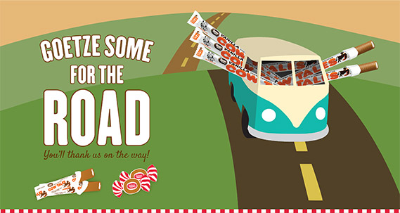
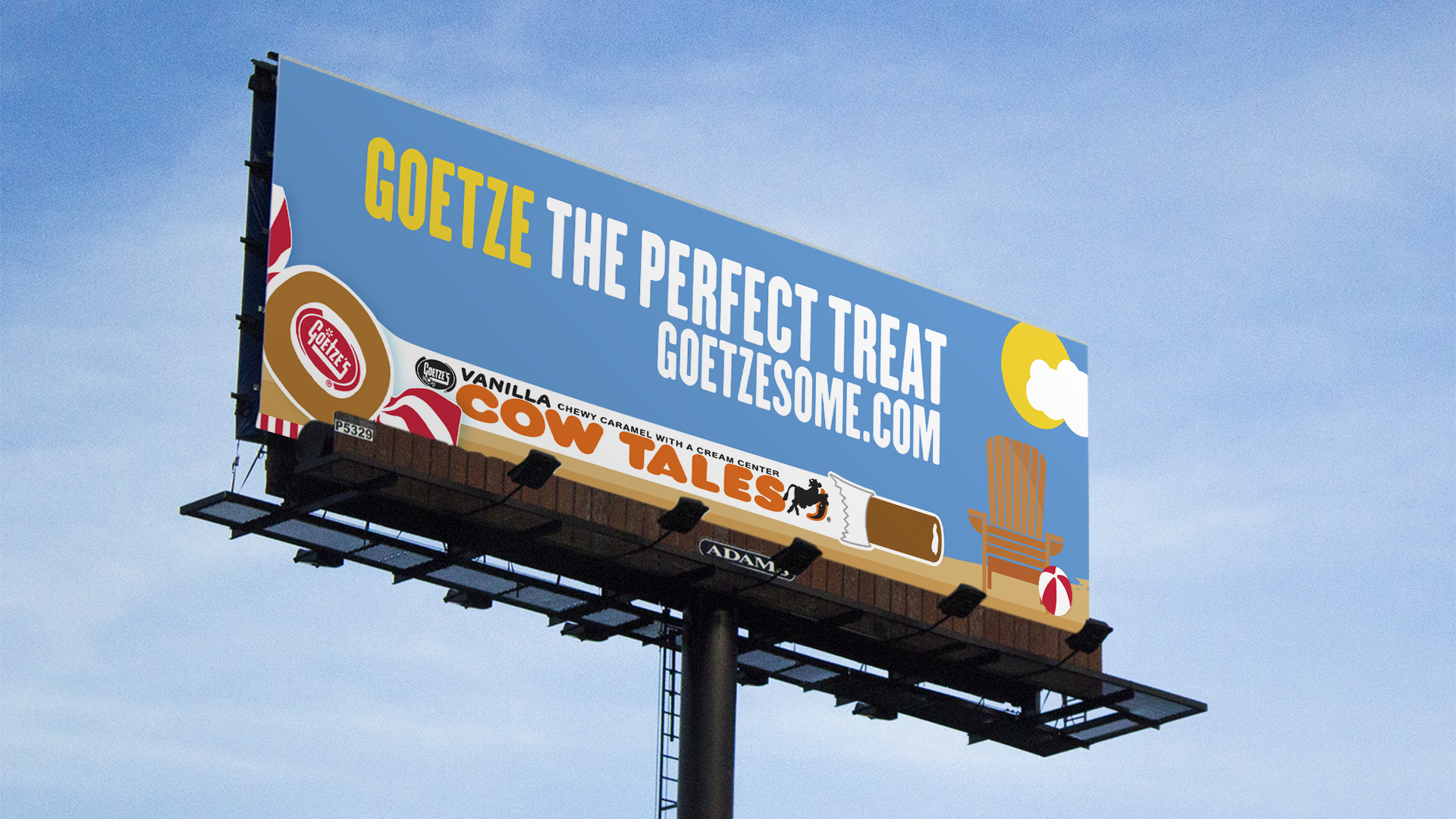
To reinforce the iconic look, history and sentiment of the candy, we created a campaign using simple and fresh graphics in the color palette of the product itself. Each iteration of the creative reinforced the name of the product, while suggesting usage occasions consistent with our mid-summer campaign period.


